
Drag & Drop Card for Home Assistant
Build responsive Home Assistant dashboards visually — drag, resize, layer, and arrange Lovelace cards exactly where you want them.









Start guide · Installation · Configuration · HADS · Releases

Drag & Drop Card is a freeform canvas for the Home Assistant Lovelace UI. Arrange any compatible card visually, create responsive layouts for different devices, save or share complete designs, and turn a dashboard into a polished full-screen experience.
New here? Follow the illustrated HADS start guide for the fastest path from installation to your first dashboard. This README is the detailed reference for configuration and advanced features.
☕ Support the project
If Drag & Drop Card saves you time, you can support the project by starring the repository, sharing your dashboards, reporting useful feedback, or buying me a coffee.

📑 Contents
- Features
- Installation
- Persistence backend
- Quick start
- Dashboard mode
- Configuration options
- LLM dashboard authoring
- Editor shortcuts
- Troubleshooting
- Contributing
- Support the project
✨ Features
- Visual editing: drag, resize, stack, multi-select, and snap Lovelace cards to a configurable grid.
- Responsive layouts: design for desktop, tablet, mobile, portrait, and landscape from the same dashboard.
- Tabs, layers, and Sidebar: organize large dashboards without giving up a free-positioned canvas.
- Fast editing workflow: auto-save or apply manually, use keyboard shortcuts, undo layout changes, and edit through the built-in toolbar.
- Portable designs: export and import complete JSON layouts, individual cards, options, responsive variants, and Home Assistant packages.
- Rich presentation: use images, particles, YouTube backgrounds, animated connectors, card entrance animations, and an optional screen saver.
- Home Assistant integration: add the card through the native card picker or register it as a discoverable community dashboard on supported Home Assistant versions.
- Design ecosystem: browse and import community designs from HADS and style the outer card with
card-mod. - Self-contained bundle:
interactjsandjs-yamlare bundled; no runtime CDN is required.
📦 Installation
Option A: HACS (recommended)
- In HACS, open the menu and choose Custom repositories.
- Add
https://github.com/Prosono/Drag-And-Drop-Cardwith Dashboard as the category. - Search for Drag & Drop Card, open it, and select Download.
- Reload Home Assistant and hard-refresh the browser if the card does not appear immediately.
Option B: Manual
- Download the compiled
dist/drag-and-drop-card.jsfile. - Copy it to
/config/www/drag-and-drop-card.js. - Add it under Settings → Dashboards → Resources, or add the Lovelace resource in YAML:
url: /local/drag-and-drop-card.js
type: module
After adding a new resource, clear browser cache or hard-reload to ensure the module loads.
🔁 Persistence backend
Recommended: Install the Drag & Drop Card Backend to keep editor changes in Home Assistant, make layouts available across browsers and devices, and sync optional packages.
Without the backend, the card falls back to browser localStorage. That is useful for testing, but the layout remains tied to that browser profile and can be lost when site data is cleared.
Advanced: layout storage
Dashboard Settings → Advanced → Layout storage selects the authoritative layout source:
- DDC backend (default) keeps the existing shared-backend behavior, with browser storage as a fallback. Editing the nested
cardsarray throughlovelace/config/savedoes not override a saved DDC backend layout. - Lovelace reads and writes the layout in Home Assistant's dashboard configuration. External updates are applied when Home Assistant delivers a changed configuration or the dashboard reloads. An existing DDC backend or browser snapshot cannot override this mode.
Lovelace saving requires a UI-managed dashboard and permission to edit it. YAML-managed dashboards can read storage_mode: lovelace, but changes must be saved in their source YAML. Package definitions are retained in Lovelace mode; deployment of package files through the DDC backend is disabled. Avoid simultaneous editing in multiple browsers or tools: DDC rejects a save when it detects a changed card before writing, but Home Assistant's full-dashboard save is not an atomic conflict-resolution API.
For external tools, set storage_mode: lovelace on the outer custom:drag-and-drop-card. In this mode, top-level cards defines membership and the primary desktop layout. Compact responsive entries inherit card content; explicit per-profile card overrides remain independent and should be updated separately. An empty cards: [] clears the layout. Setting the mode directly in configuration uses that configuration immediately; only switching in the settings dialog copies the visible layout first.
type: custom:drag-and-drop-card
storage_key: my_dashboard
storage_mode: lovelace
cards: [] # Replace with your complete DDC card entries before applying.
🚀 Quick Start
Add a Drag & Drop Card to your dashboard using YAML:
type: custom:drag-and-drop-card
storage_key: livingroom_layout         # unique key per canvas
grid: 20                               # pixel grid size (default editor stub)
drag_live_snap: true                   # snap while dragging/resizing
auto_save: true                        # auto-save after edits
auto_save_debounce: 800                # ms debounce
container_size_mode: auto              # auto | fixed_custom | preset
container_background: transparent      # canvas background
card_background: var(--ha-card-background, var(--card-background-color))
disable_overlap: false                 # prevent overlapping when true
background_mode: none                  # none | image | particles | youtube
debug: false                           # verbose console logs
Now:
- Long-press on blank canvas (≈1s) or double-click an empty area to enter Edit Mode.
- Use the toolbar to Add cards, Import/Export, Apply, or Exit edit mode.
- Ctrl/Cmd + S applies (saves) the layout while in edit mode.
- Esc exits edit mode.
Editor appearance
The editor defaults to Light, independently of your Home Assistant dashboard theme. Change it using the Editor toolbar button or Dashboard Settings → Appearance → Editor appearance. Choose Light, Dark, or Follow dashboard.
Light and Dark use their own accent and button-label colors to maintain contrast when the dashboard uses a different theme. Dashboard cards keep their viewing theme. This preference is saved locally in your browser for each dashboard (storage_key).
🧩 Add as a Dashboard
Home Assistant 2026.5 introduced discoverable community dashboard strategies. This card registers a dashboard strategy named Drag & Drop Dashboard, so after the resource is loaded you can create a new dashboard from the Add dashboard dialog instead of starting from an empty dashboard and adding the card manually.
The generated dashboard contains a single panel view with one full-width Drag & Drop Card. You can also use the strategy in YAML:
strategy:
  type: custom:drag-and-drop-card
  title: Drag & Drop Dashboard
  storage_key: my_drag_drop_dashboard
Optional strategy settings:
| Key | Type | Description |
|-----|------|-------------|
| title | string | Dashboard title used by the generated dashboard. |
| storage_key | string | Persistent Drag & Drop Card layout key. If omitted, one is derived from the dashboard details. |
| view_title | string | Title for the generated panel view. Defaults to Home. |
| view_path | string | URL path for the generated view. Defaults to home. |
| view_icon | string | Icon for the generated view. Defaults to mdi:home. |
| card | object | Extra Drag & Drop Card options merged into the generated card. |
🧭 Tabs
You can define multiple tabs inside a single Drag & Drop card. Each tab has its own layout.
type: custom:drag-and-drop-card
storage_key: multi_tab_example
tabs:
  - id: home
    label: Home
    icon: mdi:home
    label_mode: both     # icon | label | both
  - id: media
    label: Media
    icon: mdi:television
    label_mode: icon
default_tab: home
hide_tabs_when_single: true- The card remembers the last active tab per
storage_key. - Reorder tabs with the up/down controls in Dashboard Settings → Tabs.
- When there is only one tab and
hide_tabs_when_single: true, the tab bar is hidden.
🎆 Backgrounds
Background behavior is controlled by background_mode:
none(default): no special background.image: usesbackground_image.particles: usesbackground_particles.youtube: usesbackground_youtube.
Image background
type: custom:drag-and-drop-card
storage_key: fancy_bg
background_mode: image
background_image:
  src: /media/your/folder/background.png  # or any HA-accessible URL
  size: cover                             # cover | contain | 100% 100% | …
  position: center center                 # CSS background-position
  repeat: false                           # true | false | 'repeat'
  opacity: 0.85                           # 0–1
  attachment: scroll                      # scroll | fixed
  filter: blur(4px) brightness(0.8)       # CSS filter() chain
Particle background (advanced)
background_mode: particles
background_particles:
  preset: default   # implementation-specific; see docs/updates if provided
  # Additional particle config may be supported in future versions.
YouTube background (advanced)
background_mode: youtube
background_youtube:
  video_id: dQw4w9WgXcQ      # YouTube video id
  mute: true
  loop: true
  start: 0
  end: 0                     # 0 = entire video
  size: cover                # cover | contain | fill
  attachment: fixed          # fixed | scroll
Exact options for particles and YouTube are implementation-oriented; the above gives the general structure used by the card.
💤 Screen Saver
Optional screen saver that activates after inactivity:
screen_saver_enabled: true
screen_saver_delay: 300000   # milliseconds (e.g. 300000 = 5 minutes)
screen_saver_image: /local/screensaver.jpg
When enabled, the card will enter a “screen saver” state after the delay. You can use the built-in visual presets or set screen_saver_image to replace the preset background with your own uploaded image, Home Assistant media URL, or external image URL.
⚙️ Configuration Options
Below is a summary of the main configuration options. Many have reasonable defaults and only need to be set when you want custom behavior.
| Key | Type | Default | Description |
|--------------------------------|-----------|----------------------------|-------------|
| storage_key | string | _auto_ | Unique ID for storing this canvas’ layout. If omitted, one is generated. |
| grid | number | 10 | Grid size in px used for snapping and guides. New cards created via the stub start at 20. |
| drag_live_snap | boolean | false | Snap while dragging/resizing (live feedback). |
| auto_save | boolean | true | Automatically save changes. |
| auto_save_debounce | number | 800 | Debounce window (ms) for auto-save. |
| container_size_mode | string | auto | auto selects separate Desktop/Tablet/Mobile layouts from the browser's CSS viewport. Use fixed_custom or preset for one exact wall-panel canvas. Legacy dynamic configs are automatically migrated to auto. |
| container_fixed_width | number | null | Fixed width (px) when fixed_custom. |
| container_fixed_height | number | null | Fixed height (px) when fixed_custom. |
| container_preset | string | fhd / fullhd | Device/display preset key (see below) when preset. |
| container_preset_orientation | string | auto | auto \| portrait \| landscape. |
| auto_viewport_max_width | number | 0 | Upper limit for the live Auto canvas width in CSS px; it is not a target resolution. 0 or empty keeps the old unlimited behavior. |
| auto_scale_max | number | 0 | Caps the live Auto canvas scale. 0 or empty keeps the old unlimited behavior. |
| container_background | string | transparent | Canvas background (e.g. color/gradient). |
| card_background | string | var(--ha-card-background, var(--card-background-color)) | Default background for wrapped cards. |
| card_overflow | string | auto | Dashboard-wide card overflow default: auto, hidden, or visible. Per-card settings override it. |
| disable_overlap | boolean | false | If true, prevents overlapping during edit (experimental - NOT RECCOMENDED WHEN USING TABS!). |
| animate_cards | boolean | false | If true, cards animate in when switching tabs or loading. |
| background_mode | string | none | none \| image \| particles \| youtube. |
| background_image | object | _none_ | Image background settings when background_mode: image. |
| background_particles | object | _none_ | Particle background settings when background_mode: particles. |
| background_youtube | object | _none_ | YouTube background settings when background_mode: youtube. |
| screen_saver_enabled | boolean | false | Enable screen saver mode. |
| screen_saver_delay | number | 300000 | Screen saver delay in ms (fallback to 5 minutes if invalid). |
| screen_saver_image | string | _none_ | Optional custom screen saver background image URL or uploaded data URL. |
| tabs | array | [] | Tab definitions (see Tabs section). |
| tabs_position | string | top | Place the tab bar at the top or bottom of the viewport. |
| tabs_style | object | {} | Optional per-dashboard tab appearance overrides (see below). |
| tabs_size | number | 100 | Tab bar scale as a percentage from 80 to 140. |
| default_tab | string | first tab id / 'default' | Default tab id when the card loads. |
| hide_tabs_when_single | boolean | true | Hide tab bar when there is only one tab. |
| card_shadow | boolean | false | Apply a drop shadow to card wrappers. |
| hide_HA_Header | boolean | false | Hide the Home Assistant top header while in this card. |
| hide_HA_Sidebar | boolean | false | Hide the Home Assistant sidebar while in this card. |
| edit_mode_pin | string | '' | Optional PIN required to enter edit mode (via supported UI). |
| debug | boolean | false | Extra logging to the console. |
| card_mod | object | _none_ | Card-mod config for the main card. |
| cards | array | _none_ | Initial child cards (see below). |
Preset Keys (examples)
- Phones:
iphone-14-pro,iphone-14-pro-max,iphone-se-2,pixel-7,galaxy-s8,galaxy-s20-ultra - Tablets:
ipad-9-7,ipad-11-pro,ipad-12-9-pro,surface-go-3 - Desktops:
hd,wxga-plus,fhd,qhd,ultrawide-uwqhd,uhd-4k
You can switch size mode at any time; the canvas will re-render accordingly.
🧱 Adding Cards
Use the Add button in edit mode to pick from standard Lovelace cards or drag across an area to add a card directly to the grid.
The picker offers three ways to start:
- Cards — choose the exact Home Assistant or Drag & Drop Card type.
- By entity — search for an entity, then choose from every compatible starting card. The domain-aware recommendation appears first, while alternatives such as Tile, Button, Entity, Glance, graphs, and DDC Icon remain available when supported. Installed custom cards are detected from Home Assistant's card registry and included when they safely match the selected domain, including Mushroom, Bubble Card, Button Card, Mini Graph Card, and other recognized cards. Compatible owned or free single-card designs from HADS are included too; selecting one downloads it, replaces its original entity with your selection, and opens the normal editor before it is added.
- HADS — browse cards and dashboard packages from the Home Assistant Dashboard Store.
Each added card is wrapped in a draggable/resizable container that participates in snapping and layout persistence.
💾 Persistence & Storage
- Layouts are saved per
storage_key. - Primary storage uses Home Assistant’s backend integration when available; otherwise falls back to
localStorage(ddc_local_) in the browser. - When backend becomes available, local layouts are migrated automatically.
- When the backend is connected, a reload treats its shared snapshot as authoritative instead of allowing an older browser-local copy to overwrite it.
- Saves use a three-way merge, so independent PC and tablet edits are preserved across responsive profiles. If both devices change the exact same field before either reloads, the device that saves last resolves that field.
- Auto-save is enabled by default; you can also use the Apply button or Ctrl/Cmd + S in edit mode for manual saves.
auto_viewport_max_width is only a width cap. For a dashboard that targets one wall panel and should always use one exact design surface, choose Fixed (custom) or a matching Preset instead.
📤 Export / 📥 Import
- Export produces a JSON file with version, options, and cards.
- Import reads JSON, applies
options(includingcard_mod, tab definitions, etc.), rebuilds the canvas, and keeps yourstorage_keyintact.
🤖 LLM Dashboard Authoring Reference
This section is written to make it easy for an LLM, agent, or automation tool to generate valid importable Drag & Drop Card dashboards without reverse-engineering the source code.
Purpose
When generating a dashboard JSON for Drag & Drop Card, the model should think in five layers:
options: dashboard-level behavior and stylingcards: the desktop/base layout entriesresponsive_layouts: per-device or per-orientation variantsresponsive_connectorsinsideoptions: animated line overlays between itemspackages: optional Home Assistant YAML bundles synced by the backend
Top-level JSON shape
An importable dashboard JSON should follow this structure:
{
  "version": 3,
  "options": {},
  "cards": [],
  "responsive_layouts": {},
  "packages": []
}
Minimal working example
{
  "version": 3,
  "options": {
    "grid": 20,
    "auto_save": true,
    "container_size_mode": "auto",
    "tabs": [
      { "id": "overview", "label": "Overview", "icon": "mdi:view-dashboard" }
    ],
    "default_tab": "overview",
    "hide_tabs_when_single": true
  },
  "cards": [
    {
      "id": "layout_card_title",
      "card": {
        "type": "custom:ddc-text-card",
        "text": "Hello dashboard",
        "variant": "title"
      },
      "position": { "x": 40, "y": 40 },
      "size": { "width": 420, "height": 120 },
      "z": 6,
      "tabId": "overview"
    }
  ],
  "responsive_layouts": {
    "desktop": {
      "cards": [],
      "landscape": { "cards": [] }
    },
    "tablet": {
      "cards": [],
      "landscape": { "cards": [] },
      "portrait": { "cards": [] }
    },
    "mobile": {
      "cards": [],
      "landscape": { "cards": [] },
      "portrait": { "cards": [] }
    }
  },
  "packages": []
}
Card entry format
Each dashboard item is stored as a layout entry:
{
  "id": "layout_card_1",
  "card": {
    "type": "entities",
    "title": "Example"
  },
  "position": { "x": 0, "y": 0 },
  "size": { "width": 280, "height": 180 },
  "z": 6,
  "tabId": "overview",
  "layerIds": ["standard"],
  "card_style": {
    "connector_anchors": "off"
  },
  "overflow": "visible"
}
Important notes
idshould be unique within the dashboard.positionandsizeare in canvas pixels.zshould usually start at6or higher.tabIdcontrols which tab the card belongs to.layerIdsis optional. If omitted, the card remains visible for backward compatibility.card_styleis optional and contains per-card design overrides. Setconnector_anchorstooffto hide that card's four editing anchors without removing existing connectors.
Responsive layouts
cards at the top level acts as the desktop/base layout.
responsive_layouts allows separate variants for:
desktop.landscapetablet.landscapetablet.portraitmobile.landscapemobile.portrait
{
  "responsive_layouts": {
    "desktop": {
      "cards": [/ desktop landscape cards /],
      "landscape": { "cards": [/ desktop landscape cards /] }
    },
    "tablet": {
      "cards": [/ tablet landscape fallback /],
      "landscape": { "cards": [/ tablet landscape cards /] },
      "portrait": { "cards": [/ tablet portrait cards /] }
    },
    "mobile": {
      "cards": [/ mobile landscape fallback /],
      "landscape": { "cards": [/ mobile landscape cards /] },
      "portrait": { "cards": [/ mobile portrait cards /] }
    }
  }
}
Best practice for LLMs
- Treat portrait and landscape as separate layouts for
tabletandmobile. - If the same card exists in multiple profiles, keep the same
idbut allow differentpositionandsize. - New dashboards should usually define at least:
Dashboard options most relevant to generation
These are the most important option keys for an LLM to know:
| Key | Type | Meaning |
|-----|------|---------|
| grid | number | Snap size in px |
| drag_live_snap | boolean | Snap during drag/resize |
| auto_save | boolean | Save automatically |
| auto_save_debounce | number | Auto-save delay in ms |
| container_size_mode | string | auto, fixed_custom, preset |
| auto_viewport_max_width | number | Upper limit for the live Auto viewport width in CSS px; it does not force that width. 0 means unlimited |
| auto_scale_max | number | Maximum live Auto scale; 0 means unlimited |
| container_background | string | Dashboard background color or gradient |
| card_background | string | Default wrapped card background |
| card_shadow | boolean | Enable default card shadows |
| animate_cards | boolean | Animate cards on tab/layer entry |
| tabs | array | Tab definitions |
| tabs_position | string | top, bottom |
| sidebar_enabled | boolean | Enable the independent Sidebar rail |
| sidebar_items | array | Sidebar content/order, e.g. navigation, weather, status, clock, date, profile |
| sidebar_style | string | glass, neon, minimal |
| sidebar_density | string | compact, comfortable, spacious |
| sidebar_accent | string | blue, cyan, purple, amber, green |
| default_tab | string | Default active tab id |
| hide_tabs_when_single | boolean | Hide tabs if only one exists |
| layers_enabled | boolean | Enable layer-based visibility |
| layers | array | Layer definitions |
| background_mode | string | none, image, particles, youtube |
| background_image | object | Image background settings |
| background_particles | object | Particle background settings |
| background_youtube | object | YouTube background settings |
| dashboard_theme_enabled | boolean | Enable Home Assistant theme styling |
| dashboard_theme | string | Theme name |
| dashboard_theme_override_all_design | boolean | Force theme to win over custom design choices |
| responsive_viewports | object | Editor preview sizes for desktop/tablet/mobile |
| responsive_viewport_aspect_locks | object | Per-profile preview ratio locks for desktop/tablet/mobile |
| responsive_connectors | object | Animated connector overlay layouts |
Local dashboard settings API
custom:ddc-html-card JavaScript can read and change dashboard-level settings through a local API exposed as ddc and helpers.ddc.
This API is intended for interactive dashboard controls such as buttons that enable/disable layers, screen saver, animations, tabs behavior, backgrounds, and other settings without opening the dashboard settings dialog.
Use the same option keys that appear in import/export JSON:
// Read a setting
const screenSaverOn = ddc.settings.get('screen_saver_enabled');
// Change a setting live for the current dashboard session
await ddc.settings.set('screen_saver_enabled', false);
// Persist the changed setting to storage/YAML when available
await ddc.settings.set('layers_enabled', true, { persist: true });
// Convenience helpers for boolean settings
await ddc.settings.enable('animate_cards');
await ddc.settings.disable('hide_tabs_when_single');
await ddc.settings.toggle('screen_saver_enabled');
// Change multiple settings at once
await ddc.settings.setMany({
  screen_saver_enabled: true,
  screen_saver_delay: 300000,
  animate_cards: false
}, { persist: true });
Available methods:
| Method | Purpose |
|--------|---------|
| ddc.settings.list() | List known settings with current values and inferred types |
| ddc.settings.all() / ddc.settings.options() | Return current dashboard options plus runtime active_tab |
| ddc.settings.get(key) | Read one setting |
| ddc.settings.set(key, value, options?) | Apply one setting |
| ddc.settings.setMany(patch, options?) | Apply several settings |
| ddc.settings.enable(key) / disable(key) / toggle(key) | Boolean convenience helpers |
| ddc.settings.save() | Persist current settings |
| ddc.settings.subscribe(handler) | Listen for local ddc:settings-changed updates |
| ddc.openSettings() | Open the dashboard settings dialog |
| ddc.saveLayout() | Save the full layout |
By default, set, setMany, enable, disable, and toggle apply settings live only. Pass { "persist": true } when the change should be saved.
Example HTML card button:
{
  "type": "custom:ddc-html-card",
  "title": "Dashboard controls",
  "html": "<button id='toggle-ss'>Toggle screen saver</button><span id='state'></span>",
  "css": "button { padding: 10px 14px; border-radius: 12px; } #state { margin-left: 10px; }",
  "js": "const btn = root.querySelector('#toggle-ss'); const label = root.querySelector('#state'); const render = () => { label.textContent = ddc.settings.get('screen_saver_enabled') ? 'On' : 'Off'; }; btn.addEventListener('click', async () => { await ddc.settings.toggle('screen_saver_enabled', { persist: true }); render(); }); const off = ddc.settings.subscribe(render); render(); return () => off();"
}
Tabs
Tabs are configured in options.tabs:
{
  "tabs": [
    { "id": "overview", "label": "Overview", "icon": "mdi:view-dashboard" },
    { "id": "energy", "label": "Energy", "icon": "mdi:flash" },
    { "id": "automation", "label": "Automation", "icon": "mdi:robot" }
  ],
  "default_tab": "overview",
  "tabs_position": "top"
}
Every card entry should then include a matching tabId.
Read or switch the active tab
Use active_tab for navigation at runtime. default_tab remains the configured starting tab and is not changed by navigation.
const currentTab = ddc.settings.get('active_tab');
await ddc.settings.set('active_tab', 'overview');
The target must be an existing tab ID, not its label. An invalid ID rejects the promise before any settings are applied. Selecting the current tab is a no-op. setMany() can combine active_tab with other settings or a new tabs list. Boolean helpers such as toggle() are not supported for this string-valued setting.
Navigation affects only this DDC instance in this browser. It remembers the last tab using the existing browser preference for the dashboard's storage_key, but never writes active_tab to the backend or Lovelace config—even with { persist: true }. With a mixed setMany() call, only the ordinary settings are persisted. settings.list() identifies active_tab with runtime: true.
Listen on the DDC host for completed switches from API calls, the tab bar, or automatic return:
const onTabChanged = (event) => {
  const { tabId, previousTabId, reason, storageKey } = event.detail;
  console.log(${previousTabId} → ${tabId}, reason, storageKey);
};
ddc.card.addEventListener('ddc:active-tab-changed', onTabChanged);
// In an HTML card script, return cleanup when the card is removed:
return () => ddc.card.removeEventListener('ddc:active-tab-changed', onTabChanged);
The event bubbles and crosses shadow boundaries (composed: true). reason is api, tab-change, or auto-return for these paths. No event is emitted for a no-op or a transition superseded by a newer navigation. For listeners outside the card, use event.target to distinguish DDC instances; dashboards may share a storage_key.
A “Back to Home” button inside an HTML card can use:
const button = root.querySelector('#back-home');
const goHome = () => ddc.settings.set('active_tab', 'overview').catch(console.error);
button.addEventListener('click', goHome);
return () => button.removeEventListener('click', goHome);
Automatic return after inactivity
Configure automatic return in Dashboard Settings → Tabs, or through ddc.settings:
await ddc.settings.setMany({
  tabs_auto_return_enabled: true,
  tabs_auto_return_tab: 'overview',
  tabs_auto_return_delay: 300000
}, { persist: true });
tabs_auto_return_delay is in milliseconds, defaults to five minutes, and is clamped to one minute–24 hours. Automatic return pauses during editing or an active screen saver. A screen saver scheduled for the same time or earlier takes priority.
Layers
Layers are independent of tabs and are used for toggling sets of cards inside the same tab:
{
  "layers_enabled": true,
  "layers": [
    { "id": "standard", "label": "Standard", "icon": "mdi:layers" },
    { "id": "energy", "label": "Energy", "icon": "mdi:flash" },
    { "id": "explainers", "label": "Explainers", "icon": "mdi:help-circle-outline" }
  ]
}
Cards can then opt into one or more layers:
{
  "layerIds": ["energy"]
}
Backward compatibility rule
If a card has no layerIds, it should still remain visible. This is intentional and should be preserved when generating new dashboards that mix old and new content.
Connectors / animated lines
Lines are not authored as normal cards anymore. They are stored in options.responsive_connectors.
Recommended shape:
{
  "responsive_connectors": {
    "desktop": {
      "connectors": [],
      "landscape": { "connectors": [] }
    },
    "tablet": {
      "connectors": [],
      "landscape": { "connectors": [] },
      "portrait": { "connectors": [] }
    },
    "mobile": {
      "connectors": [],
      "landscape": { "connectors": [] },
      "portrait": { "connectors": [] }
    }
  }
}
Each connector entry looks like this:
{
  "id": "connector_power_1",
  "tabId": "overview",
  "cardIds": ["energy_card", "battery_card"],
  "sourceCardId": "energy_card",
  "targetCardId": "battery_card",
  "layerIds": ["energy"],
  "points": [
    { "x": 120, "y": 200 },
    { "x": 420, "y": 200 },
    { "x": 420, "y": 360 }
  ],
  "entity": "input_boolean.ddc_demo_flow",
  "active_states": "on,home,open,playing,charging,active,>0",
  "arrows": "end",
  "flow_direction": "auto",
  "line_style": "dashed",
  "thickness": 10,
  "animate_mode": "active",
  "animation_speed": 1.8,
  "active_color": "var(--primary-color, #ff9800)",
  "inactive_color": "rgba(148, 163, 184, 0.42)",
  "glow": true,
  "rounded": true
}
Connector authoring rules
pointsmust contain at least two points.- Points should snap to the same grid as the dashboard.
tabIdshould match the tab where the line is visible.cardIdsshould contain the unique layout card IDs the line belongs to.sourceCardIdandtargetCardIdshould match the first and last endpoint owners when the line connects two cards.layerIdsshould be included when the line belongs to specific layers; omit it only when the line should follow layer visibility from the owning card(s).- Use
entity+active_stateswhen the line should animate or change color based on Home Assistant state. - Connector anchors can be disabled for individual cards under Card Settings → Connector anchors. Saved connectors remain attached.
Supported built-in DDC custom cards
These are the custom cards an LLM can safely generate today.
1. custom:ddc-html-card
Use this when the dashboard needs freeform HTML, CSS, and JavaScript inside a card.
{
  "type": "custom:ddc-html-card",
  "title": "Custom widget",
  "html": "<div class='demo'>Hello</div>",
  "css": ".demo { color: white; }",
  "js": "return { update(){ / read hass/states here / } };",
  "rerun_on_hass_update": false
}
Runtime JavaScript receives access to:
hassstatesconfigroothosthelpersddc
ddc object is the local dashboard API. For dashboard setting controls, prefer ddc.settings.get, ddc.settings.set, ddc.settings.toggle, ddc.settings.enable, and ddc.settings.disable.
2. custom:ddc-text-card
Use this for titles, headings, paragraphs, small labels, and rich text.
{
  "type": "custom:ddc-text-card",
  "text": "Energy overview",
  "rich_text": false,
  "rich_html": "",
  "variant": "title",
  "font_family": "",
  "font_size": 42,
  "color": "var(--primary-text-color, #f8fafc)",
  "align": "left",
  "bold": true,
  "italic": false,
  "letter_spacing": -0.03,
  "line_height": 1.05
}
When rich_text is enabled, use rich_html as the canonical content.
3. custom:ddc-icon-card
Use this for pure design icons or state-driven status icons.
{
  "type": "custom:ddc-icon-card",
  "icon": "mdi:flash",
  "entity": "input_boolean.ddc_demo_flow",
  "size": 96,
  "color": "var(--primary-color, #ff9800)",
  "active_color": "#22c55e",
  "state_based_color": true,
  "glow": true,
  "rotate": 0,
  "pulse_when_active": true,
  "opacity_based_on_state": false,
  "active_opacity": 1,
  "inactive_opacity": 0.28,
  "active_states": "on,home,open,playing,charging,active,>0",
  "click_action": "none"
}
This card is intended to be visually transparent around the icon itself.
4. custom:ddc-table-card
Use this for visual comparison tables, badges, and entity state summaries.
{
  "type": "custom:ddc-table-card",
  "title": "System matrix",
  "rows": 3,
  "columns": 3,
  "header_row": true,
  "border": true,
  "radius": 16,
  "spacing": 8,
  "cells": [
    { "type": "text", "text": "Area", "align": "left" },
    { "type": "text", "text": "State", "align": "center" },
    { "type": "text", "text": "Action", "align": "center" },
    { "type": "icon", "icon": "mdi:flash", "text": "Power", "align": "left" },
    {
      "type": "entity",
      "entity": "sensor.ddc_demo_status",
      "text": "Live",
      "align": "center",
      "active_states": "on,active,>0",
      "active_color": "var(--primary-color, #ff9800)",
      "inactive_color": "rgba(148, 163, 184, 0.18)"
    },
    {
      "type": "button",
      "entity": "input_boolean.ddc_demo_flow",
      "text": "Inspect",
      "button_action": "more-info",
      "align": "center"
    }
  ]
}
Supported cell types:
texticonentitybadgebutton
Standard Home Assistant cards
The dashboard can also contain normal Lovelace cards such as:
entitiesbuttontilegaugemarkdownglancesensorstatistics-graphhistory-graphpicture-entitypicture-glanceweather-forecasttodo-list
entry.card exactly as a normal Lovelace card config.
Packages
Packages are exported together with the dashboard and require the backend integration to sync into /config/packages.
Each package entry looks like this:
{
  "id": "package_1",
  "name": "Demo helpers",
  "filename": "demo_helpers.yaml",
  "enabled": true,
  "yaml": "input_boolean:\\n  ddc_demo_flow:\\n    name: DDC Demo Flow\\n"
}
Package authoring rules
- Only enabled packages with non-empty
yamlare written by the backend. - Package filenames are backend-normalized to a Home Assistant-safe slug.
- Home Assistant must have packages enabled in
configuration.yaml, for example:
homeassistant:
  packages: !include_dir_named packages
Single-card export / import
The editor supports exporting a single card and importing it into an existing dashboard.
When importing a single card:
- it is inserted into the current tab
- it is placed inside the active viewport
- it receives a new internal id
- it does not replace the whole dashboard
Recommended authoring strategy for LLMs
When generating a full demo dashboard, use this checklist:
- Define at least 2–3 tabs.
- If using layers, always include:
layers_enabled: true
- a standard layer
- at least one extra layer such as energy or explainers
- Place a mix of:
custom:ddc-text-card
- custom:ddc-icon-card
- custom:ddc-table-card
- custom:ddc-html-card
- Add at least one connector in
responsive_connectors. - For interactive dashboard controls, use
custom:ddc-html-cardwithddc.settings. - Keep card
tabIdand connectortabIdaligned, and bind connectors to the owning card IDs withcardIds. - If the dashboard should work on fresh installs, include demo
packages. - Prefer
mobile.portraitandtablet.landscapevariants instead of relying on desktop-only layout. - Keep
zvalues consistent and start at6.
Recommended demo dashboard ingredients
For a strong showcase dashboard, include:
- one hero title using
custom:ddc-text-card - one live KPI icon using
custom:ddc-icon-card - one table summary using
custom:ddc-table-card - one interactive HTML widget using
custom:ddc-html-card - one Entities or Button card for controls
- one or more animated connectors
- at least one background mode
- one layers example and one tabs example
- one package that creates the helper entities used by the demo
Important limitation
Do not model connectors as normal cards in new dashboards. Use responsive_connectors instead. Legacy custom:ddc-line-card data may exist in older exports, but new dashboards should rely on the connector overlay system.
🧑🏫 Editor UX & Shortcuts
- Enter Edit: Long-press on blank canvas (~1s) or double-click an empty area.
- Exit Edit: Press Esc or use the Exit button.
- Apply: Ctrl/Cmd + S in edit mode or click Apply.
- Multi-select: Drag a selection marquee; use Shift/Ctrl/Cmd to extend selection.
- Small-card resize: Compact cards keep the bottom-right resize control visible while editing.
- Edit a card: Saving card code updates that card in place; the dashboard and active tab stay mounted.
- Toolbar:
🎨 Styling & card-mod
The card supports card-mod on the outer drag-and-drop card.
Example to tweak grid color:
type: custom:drag-and-drop-card
storage_key: fancy_layout
card_mod:
  style: |
    :host {
      --ddc-grid-color: rgba(255, 255, 255, 0.15);
    }
Example to make the container fully transparent while keeping inner cards untouched:
card_mod:
  style: |
    :host {
      --ha-card-background: transparent;
      border-radius: 18px;
      overflow: hidden;
    }
.ddc-root,
    .card-container,
    .layout,
    .pane,
    .rightGrid,
    .section,
    .toolbar,
    .mdc-card,
    .card,
    .card *[class~="card"],
    .mini,
    .bd {
      background: transparent !important;
      box-shadow: none !important;
    }
Note: Only the main card supportscard_moddirectly. Inner cards should be styled via their owncard_modconfigs.
HADS – Home Assistant Dashboard Store
This card can browse and import community dashboard designs from HADS. Start with the HADS walkthrough if you want a guided setup.
For the deeper in-card marketplace integration, see the proposed HADS API contract:
docs/hads-ddc-integration-api.md🛠 Troubleshooting
- Module doesn’t load: Confirm resource URL & type. Hard-reload browser.
- Cards snap oddly: Adjust
gridor disabledisable_overlap. - Overlaps happen: Use
disable_overlap: true(experimental). - Layout didn’t persist: Ensure Apply or
auto_saveare used; checkstorage_keyand backend integration. - Imported design looks wrong: Check version & that the referenced cards exist in your system.
🎬 More demos
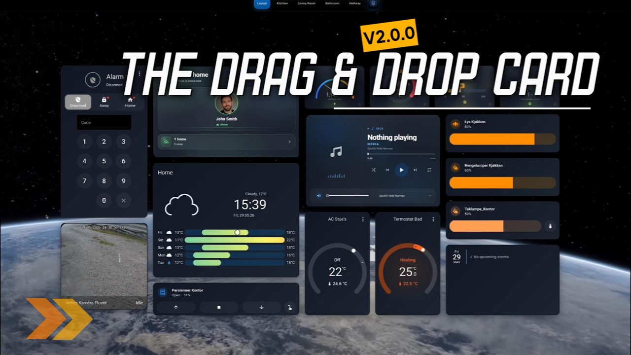
Click the preview to watch the latest release walkthrough.
For another hands-on preview, open the extended demo GIF (24 MB).
🤝 Contributing
Issues, feature proposals, documentation improvements, and pull requests are welcome.
- Check the open issues before starting larger changes.
- Fork the repository and create a focused branch.
- Install dependencies, run the tests, and build the production bundle:
npm install
npm test
npm run build- Test the result in Home Assistant, including
card-modcompatibility when your change affects styling. - Open a pull request that explains what changed and how it was verified.
📄 License
Released under the MIT License. Copyright (c) 2025 SMARTI AS.
Third-party licenses and bundled dependency notices are documented in THIRD_PARTY_NOTICES.md.
🧾 Release Notes
See GitHub Releases for version history, highlights, and upgrade notes. The installed bundle also logs its version in the browser console:
drag-and-drop-card vX.Y.Z⚠️ Known limitations
Known issues are tracked in the GitHub issue tracker. One current limitation is worth highlighting:
card-modsupport inside nested cards is still limited and may not behave as expected. The outer Drag & Drop Card supportscard_moddirectly.
Tab appearance
Dashboard Settings → Tabs → Tab appearance controls this Drag & Drop Card instance's top or bottom navigation bar. Empty fields follow the theme and Tab bar size. Reset tab appearance clears all overrides when you save.
Use tabs_style in YAML or the settings API. Icon dimensions are independent of button dimensions; oversized icons can overflow a small button. Padding changes the space inside buttons; button_gap changes the space between them. Colors accept CSS colors, including transparent and theme variables.
tabs_style:
  icon_width: 32
  icon_height: 32
  button_height: 56
  button_padding_horizontal: 4
  button_padding_vertical: 4
  button_gap: 8
  button_color: "#eeeeee"
  text_color: "#333333"
  active_button_color: "#237a57"
  active_text_color: "#ffffff"
  active_shadow: false
  bar_padding_bottom: 12
  dashboard_gap: 16
Dimensions use pixels. Icon dimensions accept 8–64, button height 32–120, horizontal padding and button gap 0–48, vertical padd
... (README truncated for length)