

Liquid Glass, take two
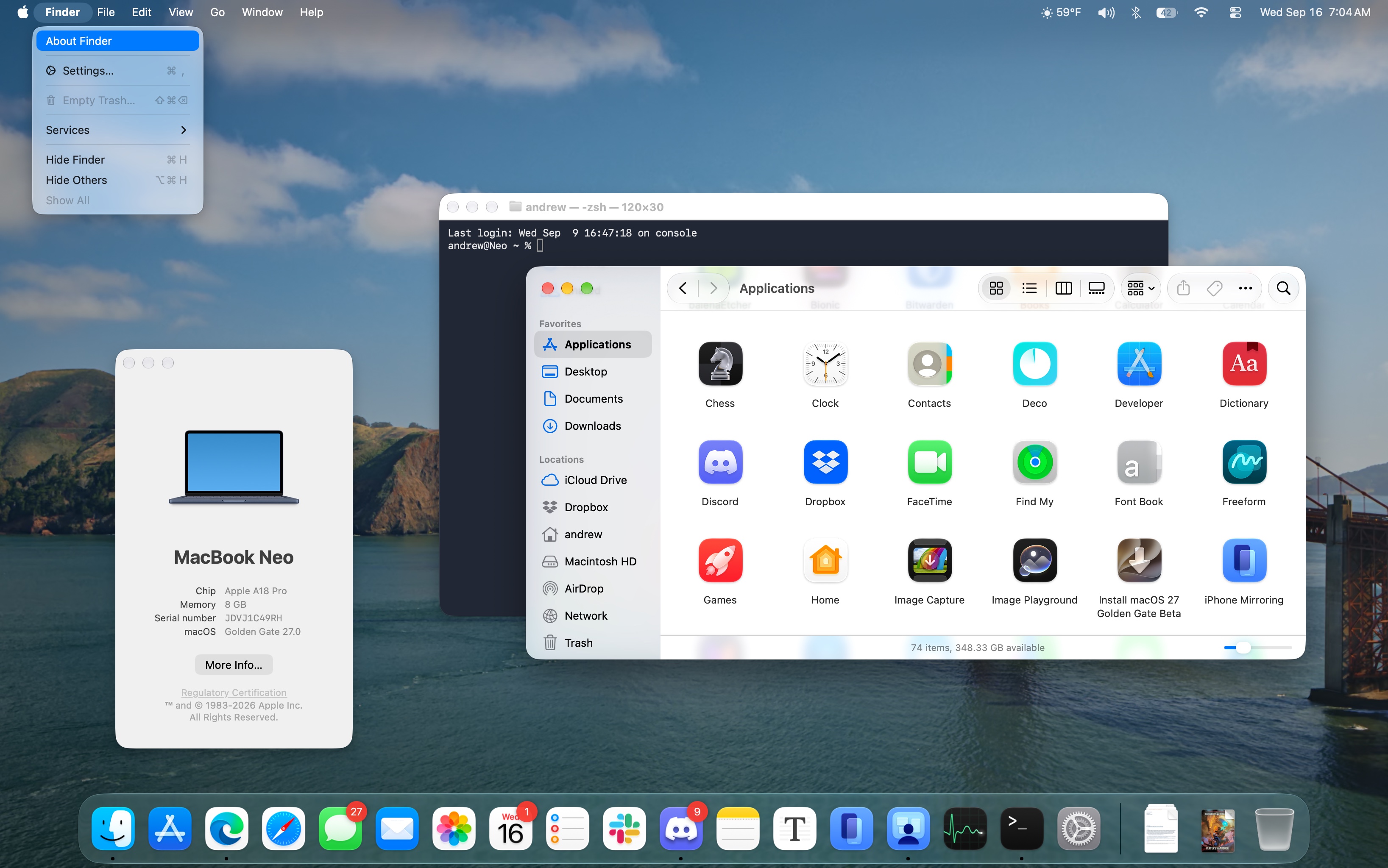
Reports that users were holding off on operating system upgrades because of the Liquid Glass makeover turned out to be based on flawed assumptions. But grumbling about the new look and feel, particularly its macOS implementation, has been steady and sustained among the Apple fan/developer community’s design nerds (my biggest gripes are catalogued in last year’s review).
The Golden Gate update to Liquid Glass solves a fair number of the most common criticisms through both design changes and customizable settings. It doesn’t fix everything, and the changes are primarily iterative—if your quarrel is with the overall design direction, this update won’t help you.
Choose your glass
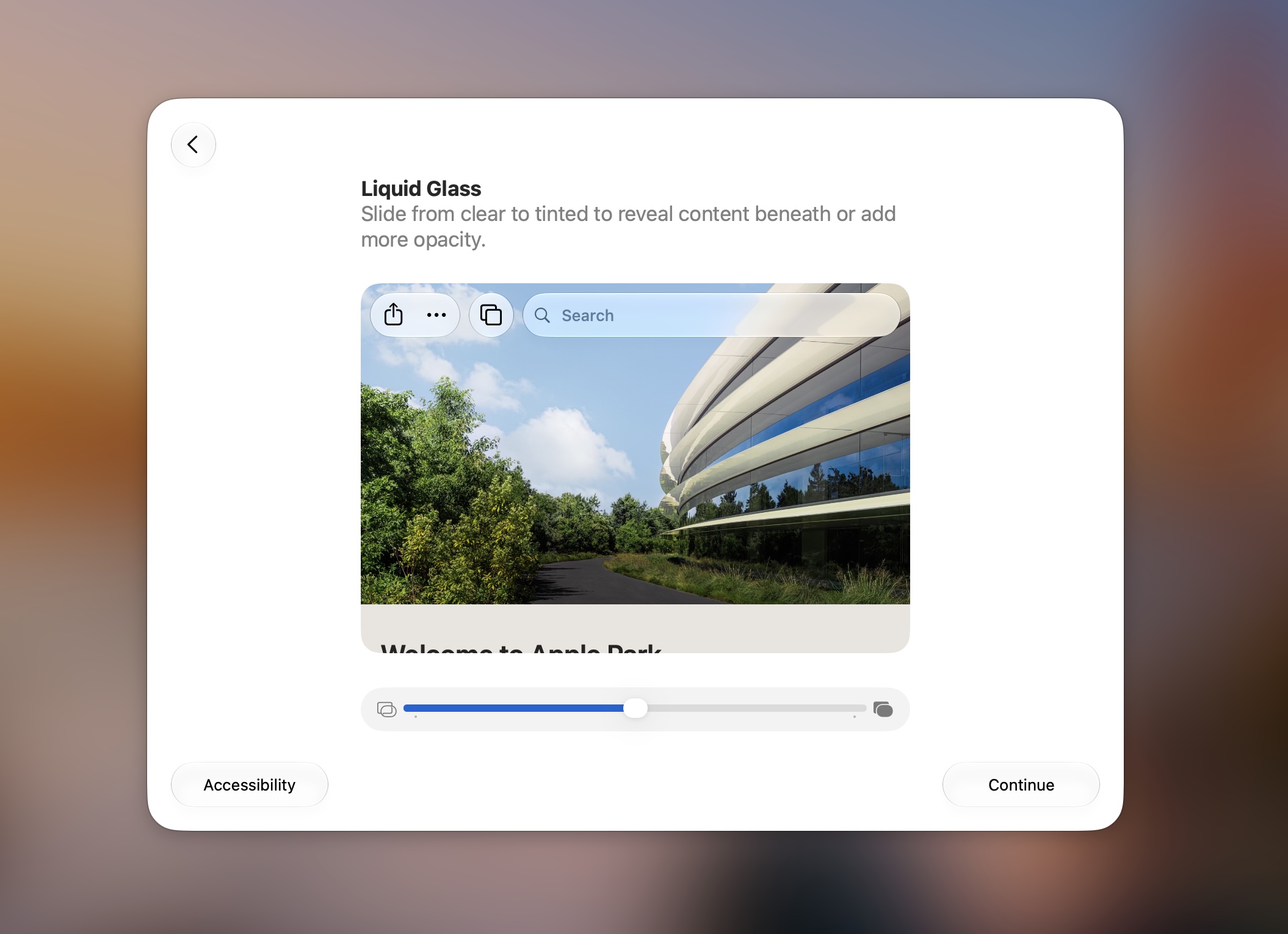
The biggest change, and one that now appears as part of the device setup flow on new or newly upgraded devices, is a slider for the intensity of the glass effect. This builds on the binary “Clear/Tinted” toggle that Apple introduced in the 26.1 update. Sliding all the way to the left embraces the glassy bits and their light-bending properties; sliding all the way to the right tones down the sheen and translucency to levels more consistent with the old Big Sur-era design. The default setting is right in the middle (I’ll be evaluating it mostly based on how that middle setting looks).
If you were already using Liquid Glass in “Tinted” mode, the new slider doesn’t really change anything for you. But if you like the glass effect, you can now decide the exact amount you want to live with.
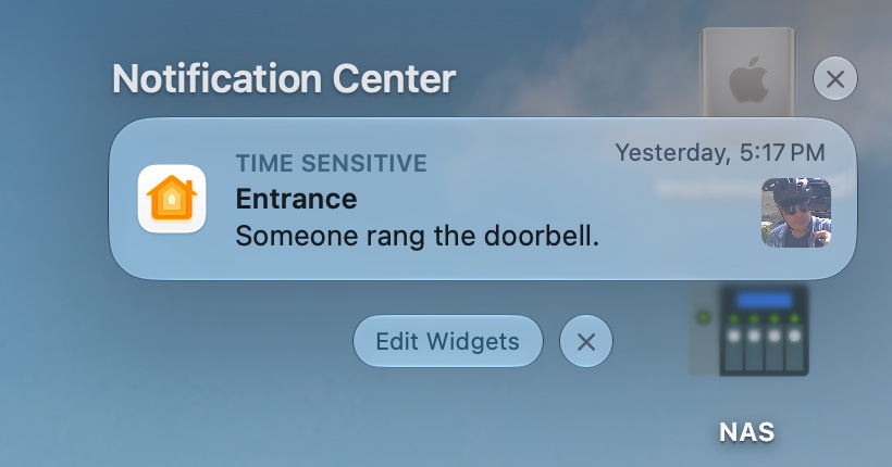
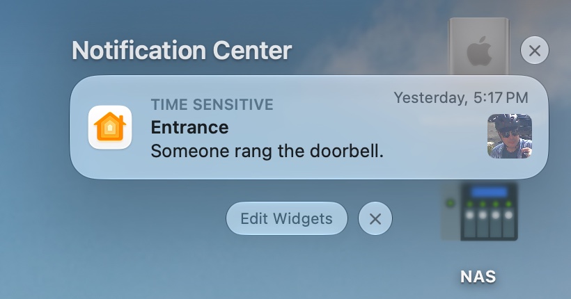
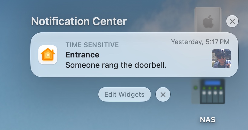
When the UI is glassy, Golden Gate includes some subtle tweaks to the way that light is refracted and how clearly shapes and colors shine through layers of glass. I’m tempted to say it helps a little with readability, but mostly I think it looks “different” instead of “better.”